
PROJECT OVERVIEW
For this project, I worked on the logged-out product team at Pinterest which focuses on improving SEO ranking and the overall user experience for core landing pages.
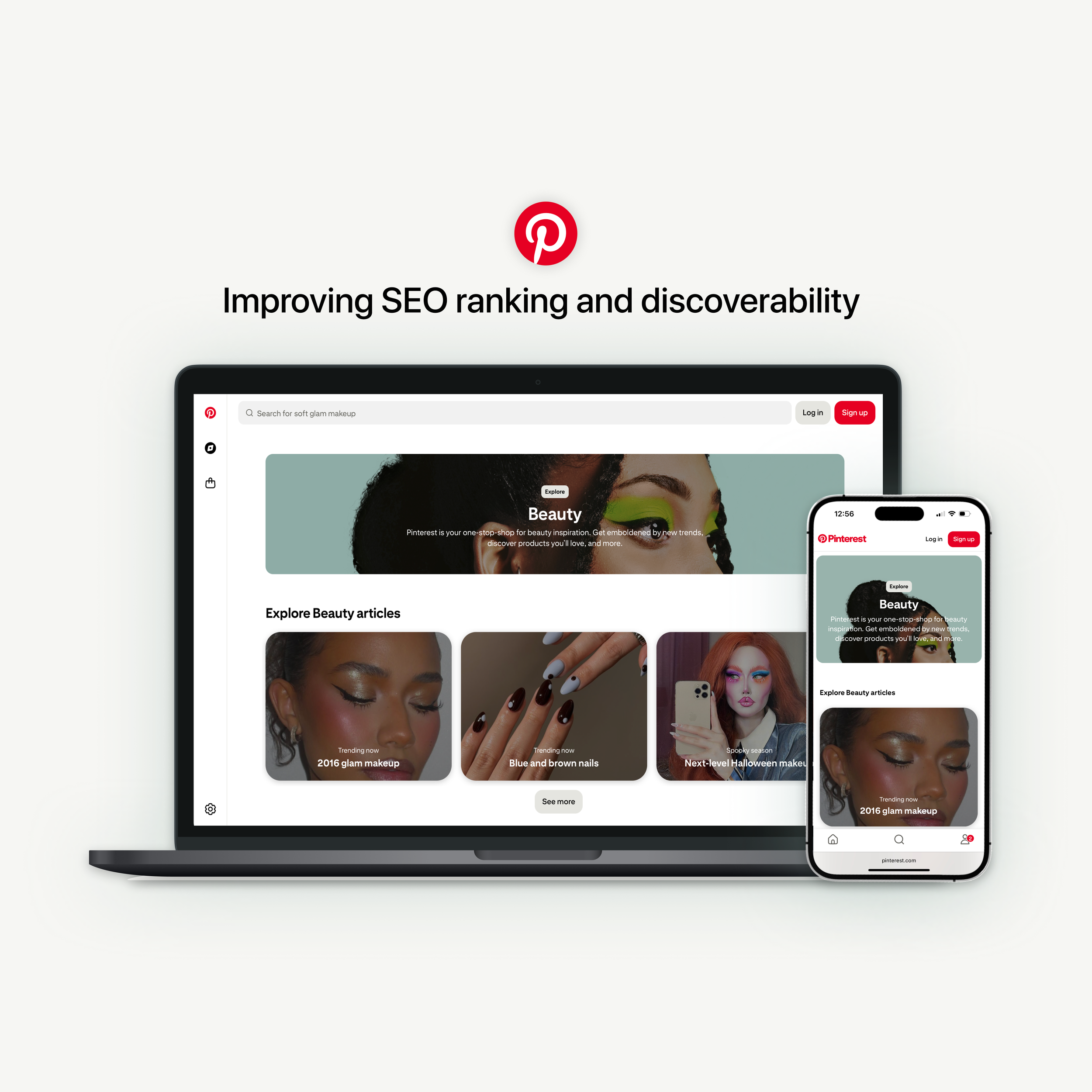
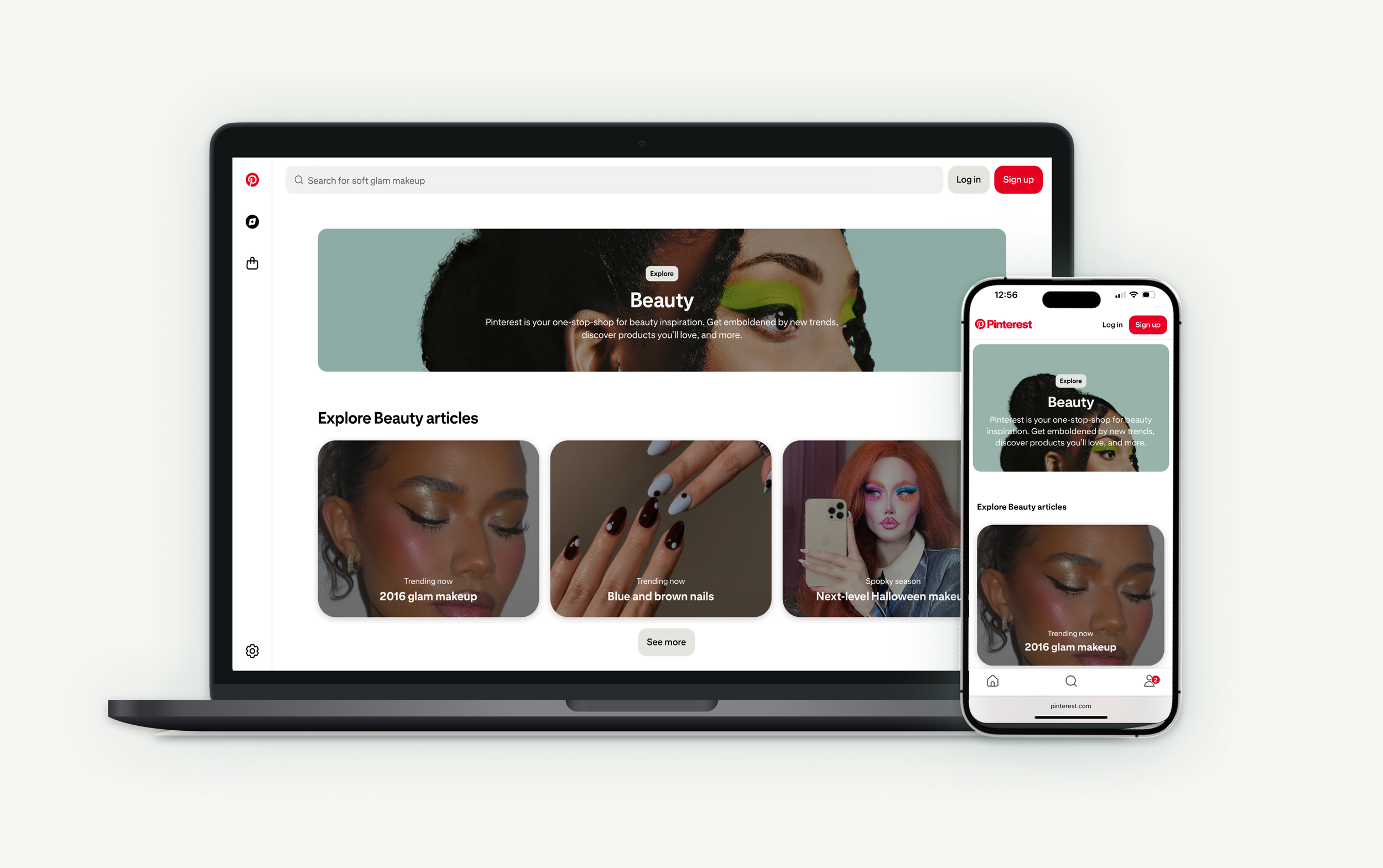
I led the redesign of pinterest.com/ideas pages, which suffered from poor content discoverability, unclear page structure, and weak navigation and interlinking—resulting in low user engagement and SEO performance. My solution included implementing a scalable design system with standardized page templates, improved navigation, and cohesive visual design to enhance discoverability for both users and search engines.
TIMELINE
~6 weeks (Q3 2023)
RESULTS
1M increase in weekly active users
685K increase in daily sessions
4.5% increase in signups
2% increase in logins
ROLE
Product designer
SUCCESS METRICS
Increase SEO ranking and # of daily sessions
DESIGN QUESTION
How might we improve discoverability and way-finding to better help users find what they are looking for and drive SEO growth?
THE PROBLEM
Pinterest has several core landings pages that are designed to support logged-out users with topical browsing and to help Google bots find top performing content.
Explore page: A central hub for exploration, that provides popular and trending ideas on Pinterest while serving as the starting point for users to discover content by category.
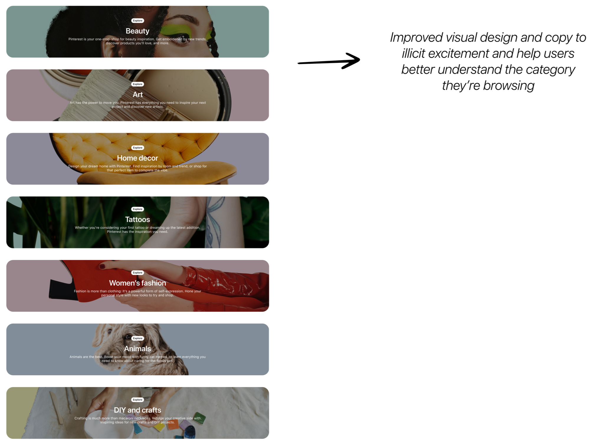
Category page: Helps users explore a variety of content across high-level categories such as beauty, women’s fashion, and food and drink.
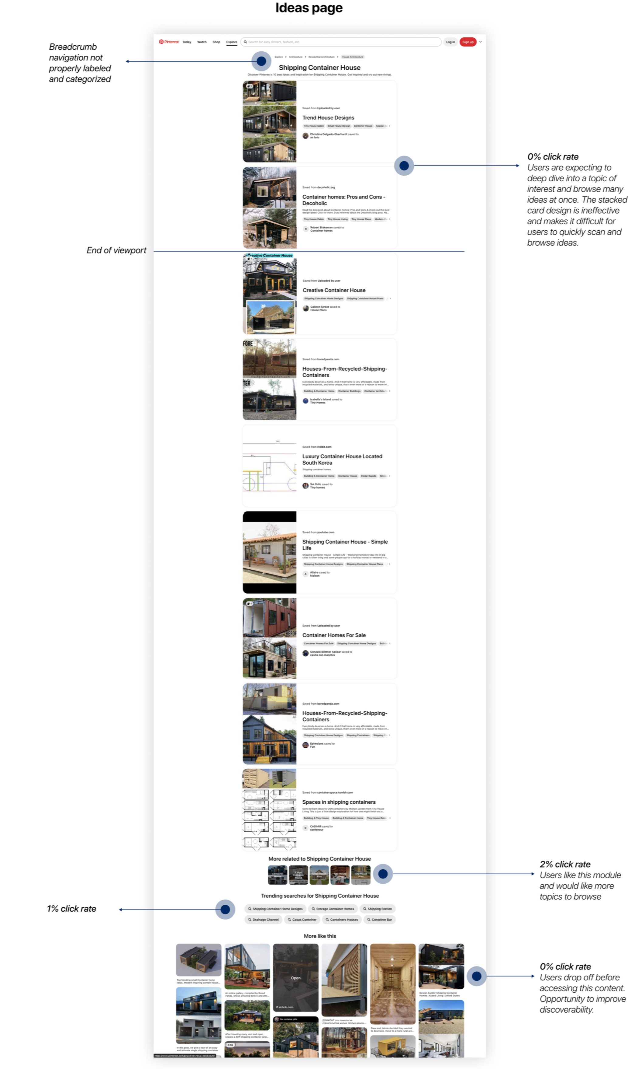
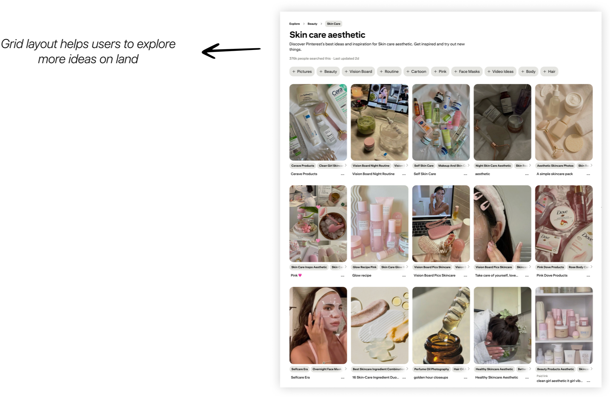
Ideas page: Helps users dive deeper to explore subcategory ideas (e.g. makeup ideas within beauty category).
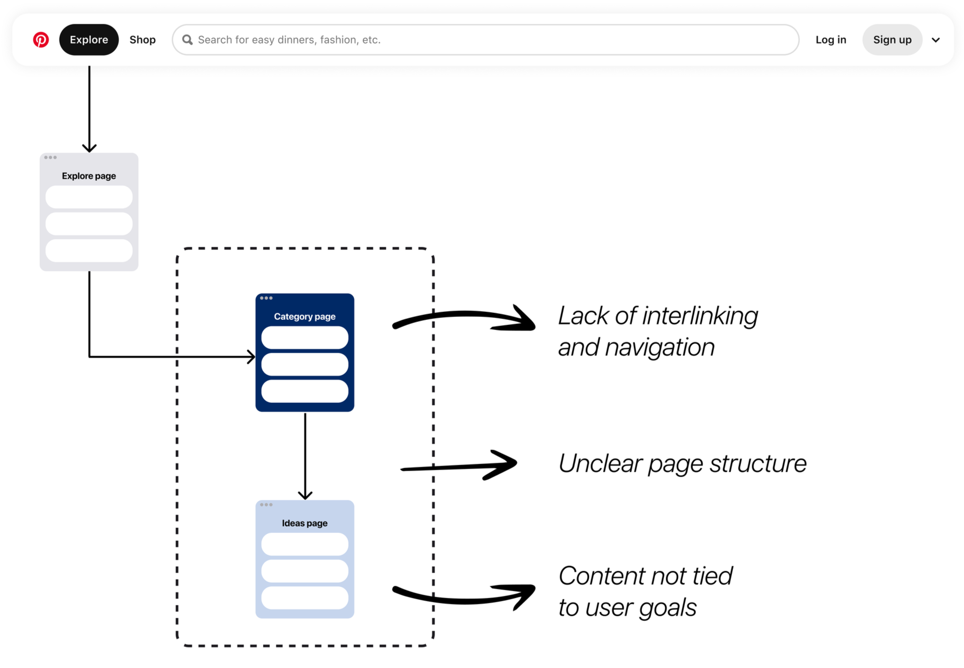
There were several key structural issues that I discovered with these pages.
Interlinking: Lack of interlinking between pages and minimal navigation to the broader Pinterest site left pages feeling isolated and difficult to navigate.
Page structure: There were no defined templates for each page type, so content varied slightly across pages, making it difficult for users to understand each page's purpose.
No clear user goals: Pages weren’t designed around user goals, making it difficult for users to find what they’re looking for.
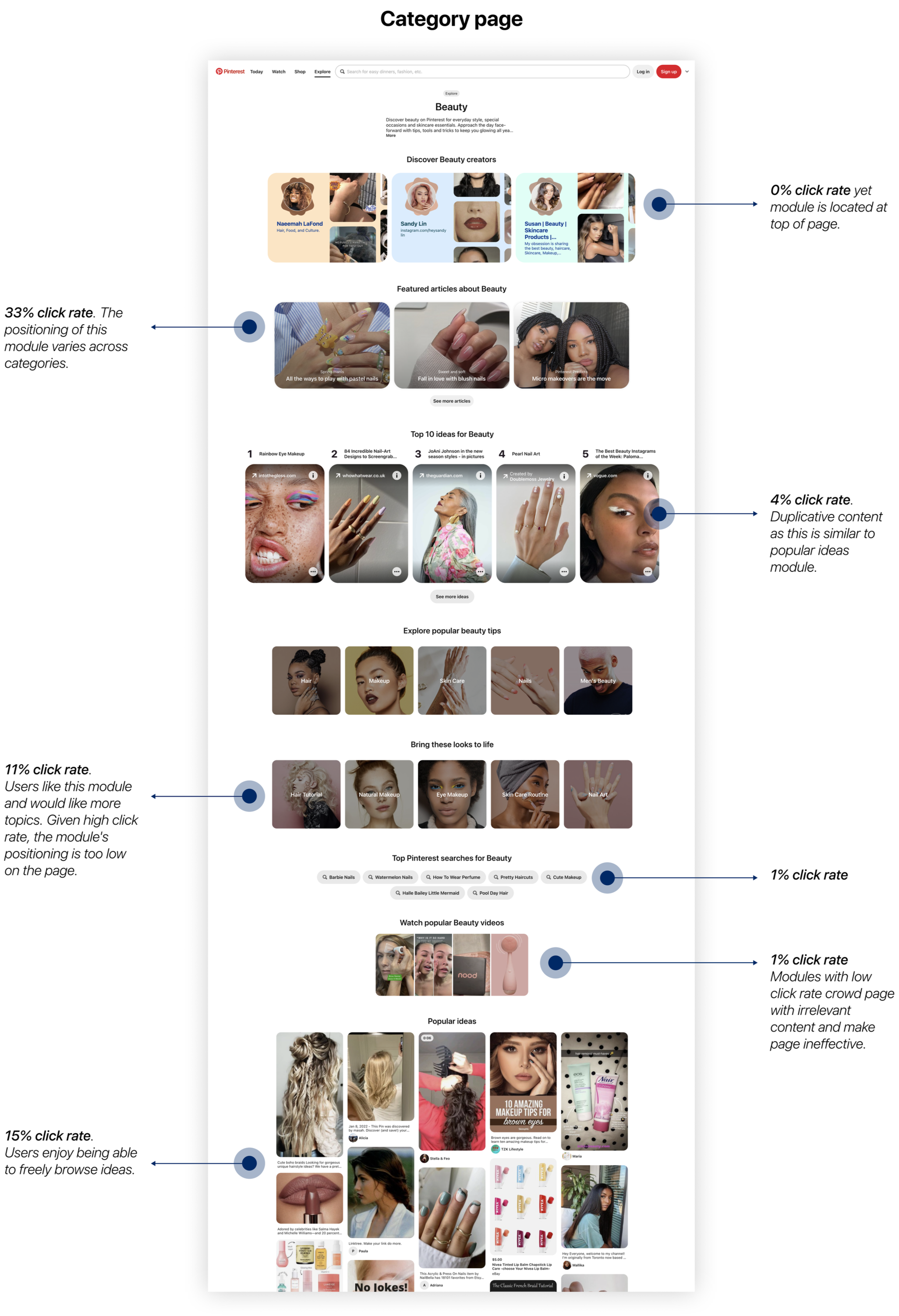
Additionally, I found several discoverability issues within each page.
Irrelevant content: Category and Idea pages included modules that weren't aligned with user interests and had low engagement rates, making pages feel overwhelming and difficult to navigate.
Poor content hierarchy: Modules with low engagement rates were positioned at the top of the page leaving a confusing first impression.
Unintuitive module design: The ideas page used a stacked card design, which limited the number of ideas users could browse on land, making the page ineffective.
DESIGN STRATEGY
In redesigning the category and ideas pages, I established several design goals to address key issues.
Design goals
Create a cohesive and consistent browsing experience through standardized page templates.
Ensure content is relevant and aligned with user intent through goal-driven modules.
Build a delightful experience that’s easy to navigate with user-friendly modules.
Standardized page templates
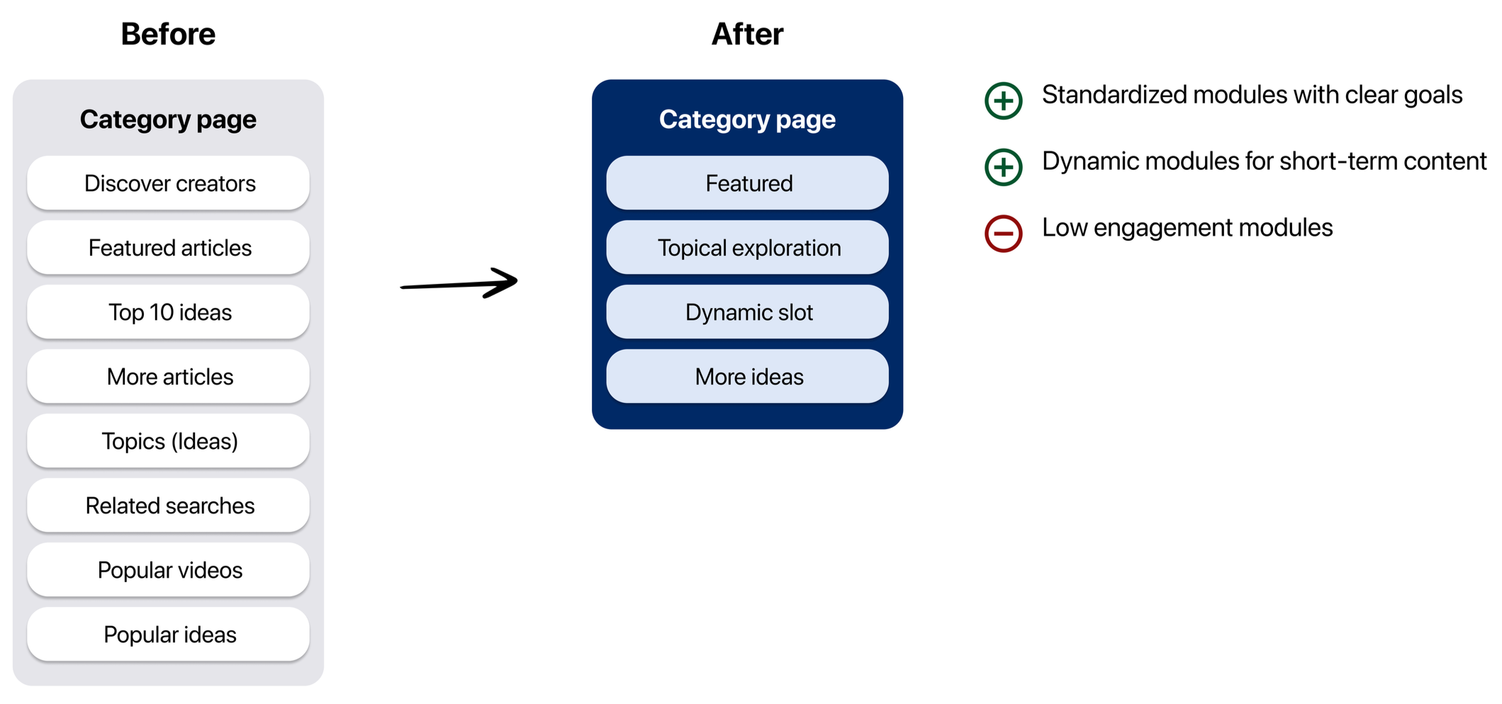
Category page template
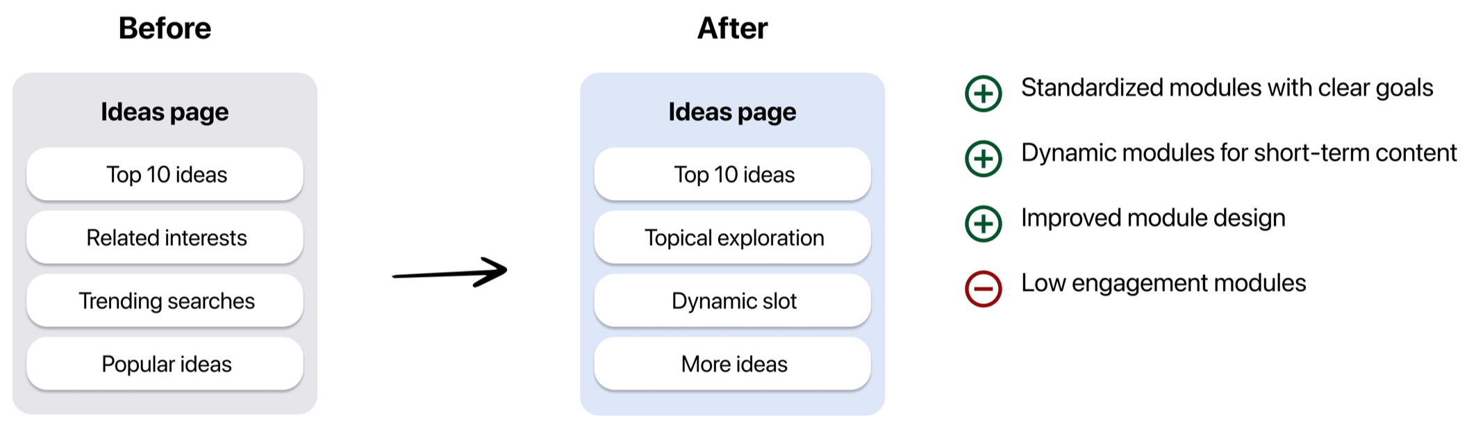
Ideas page template
Goal-driven modules
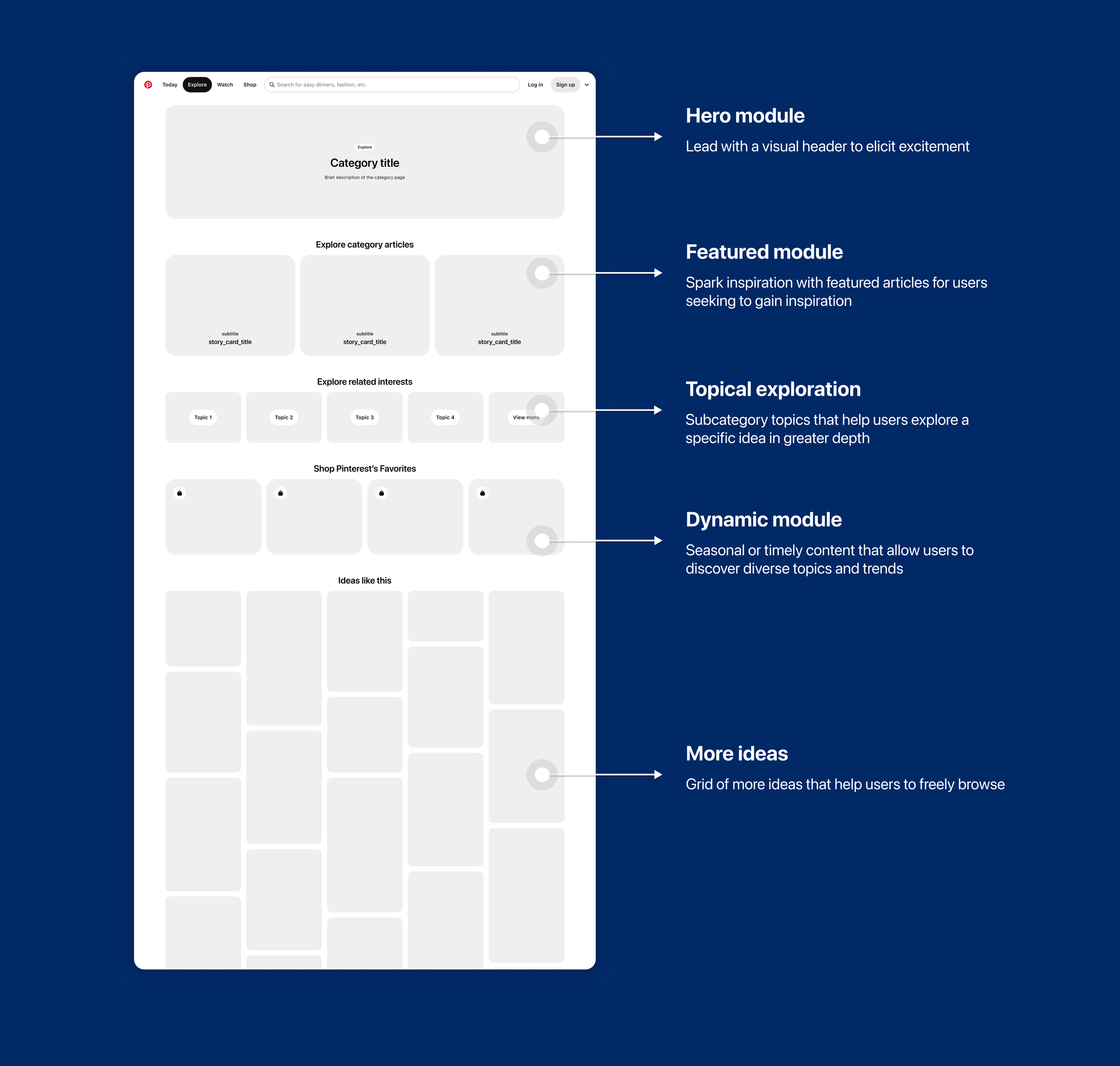
Category page wireframe
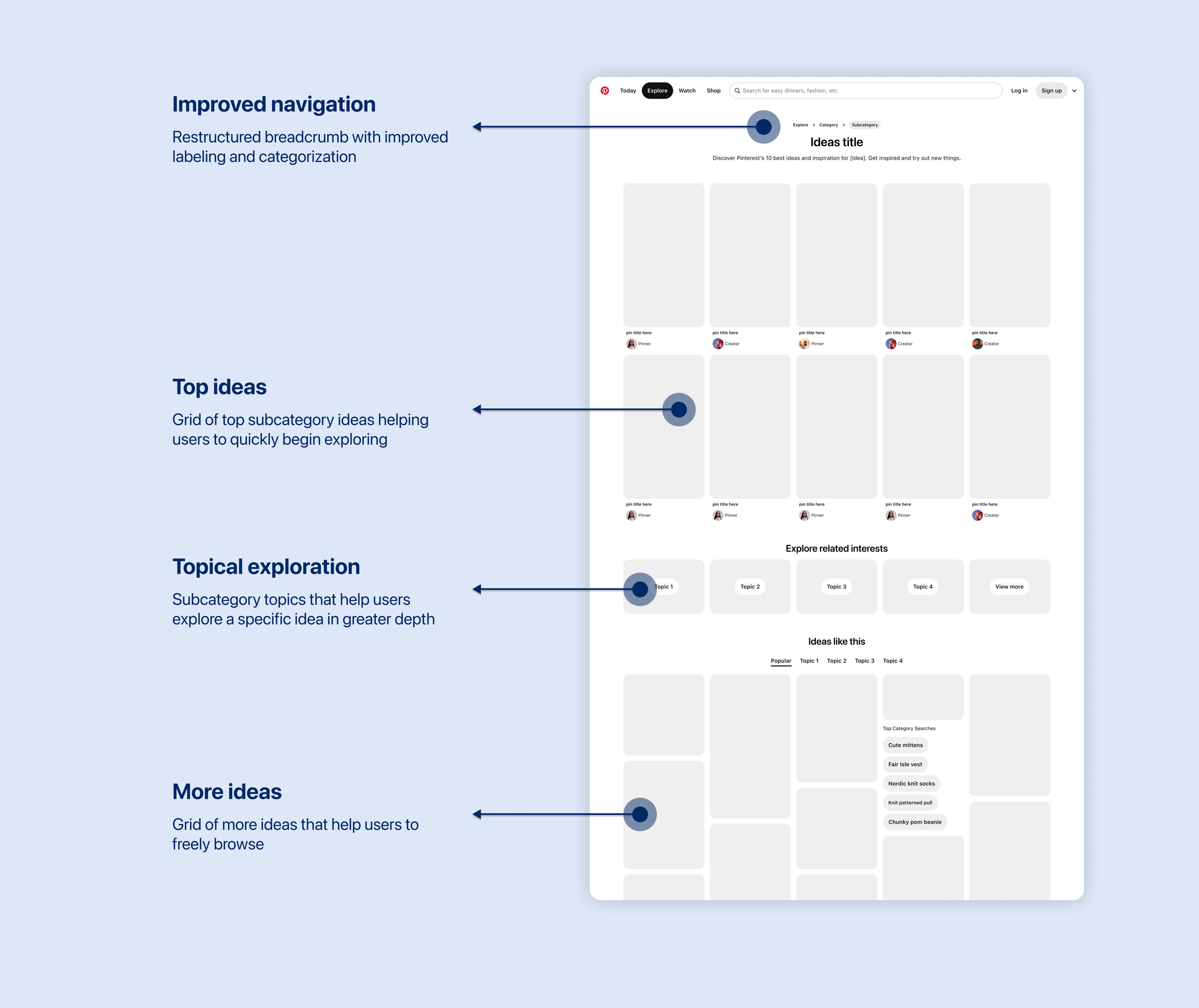
Ideas page wireframe
User-friendly modules
FINAL DESIGN
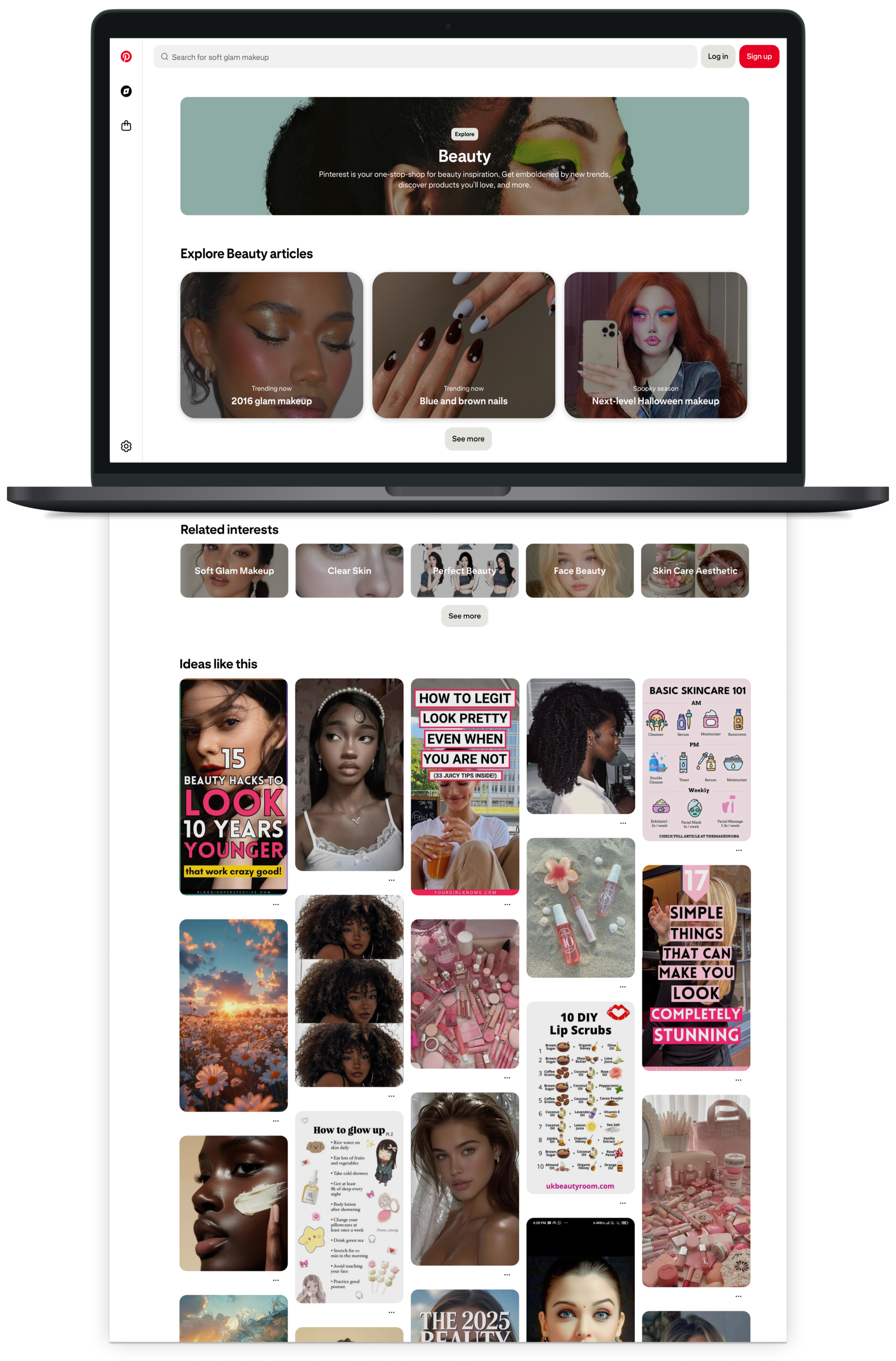
Category page (desktop)
Category page (mobile)
Ideas page (desktop)
Ideas page (mobile)
THE RESULTS 🚀
The experiment results exceeded our expectations 🎉! The redesign significantly improved discoverability for both users and search engines. The category page had a 2% increase in impressions and a 2.4% increase in session duration. The ideas page had a 685K increase in daily sessions, over 1M increase in weekly active users, a 2.5% increase in quality sessions, a 4.5% increase in clickthroughs, a 4% increase in signups, and a 2% increase in logins.
Click here to explore these pages.