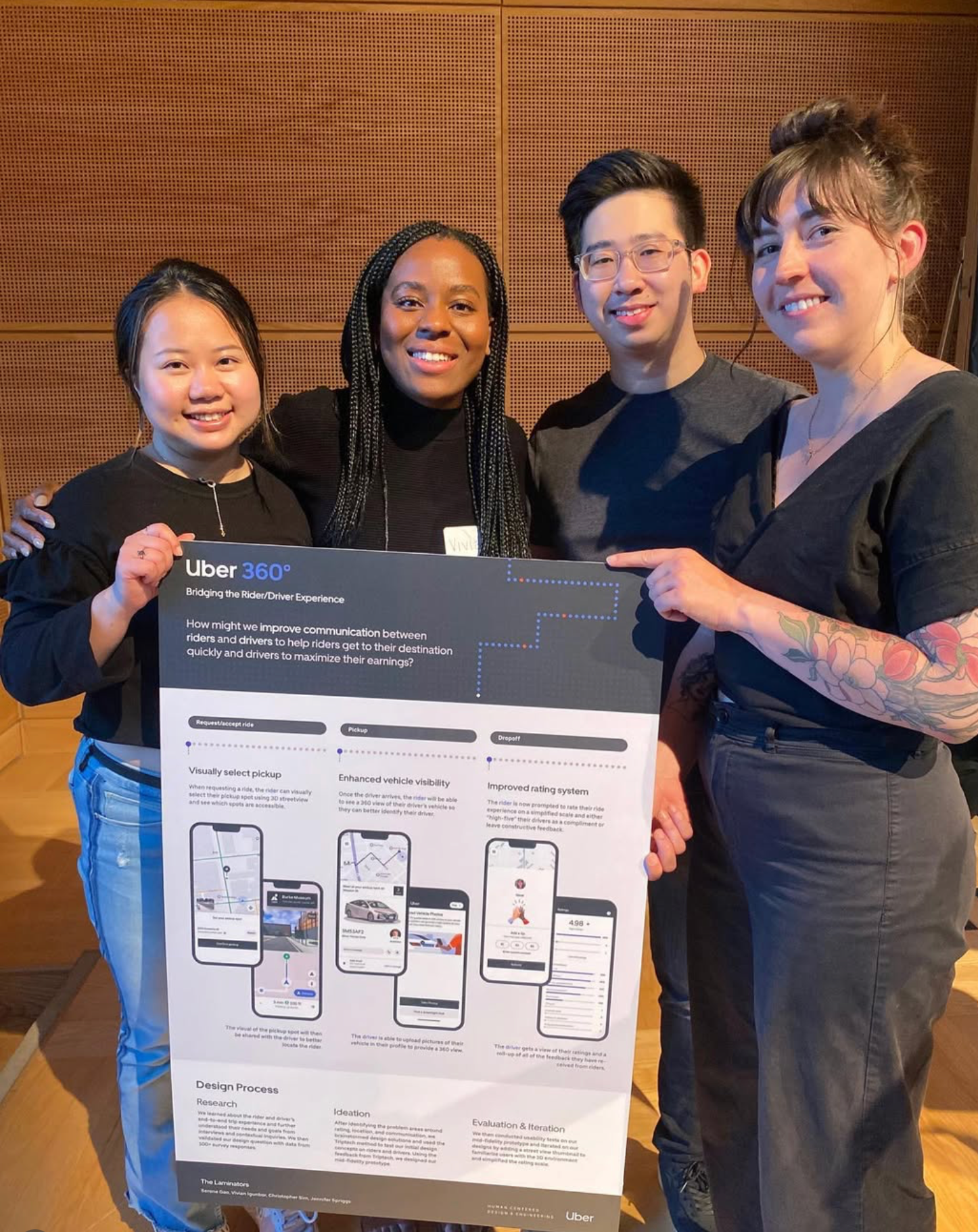
PROJECT OVERVIEW
Uber’s mission is to provide a unique ride-sharing experience that prioritizes the satisfaction of both riders and drivers. At an internal diversity event, Uber’s research team uncovered communication barriers between underrepresented drivers and riders. These insights drove the inception of this Human-Centered Design and Engineering master's capstone project. Their initial design question was “How might we create a safe, comfortable environment between rider and driver - facilitating empathetic interaction to elevate the overall trip experience?”
I collaborated with a team of designers to improve communication and the overall trip experience for both riders and drivers.
TIMELINE
Winter and spring (2022)
AWARDS 🏆
Best graduate capstone project, best in communication design
ROLE
Research & design strategy
BUSINESS GOALS
Increase rider and driver satisfaction score, Improve retention, decrease support tickets
DESIGN QUESTION
We reframed the design question based on insights from our research:
How might we improve communication between frequent riders and drivers to help riders get to their destination quickly and drivers to maximize their earnings?
THE SOLUTION
An award-winning design focused on improving trip communication between riders and drivers
PROCESS
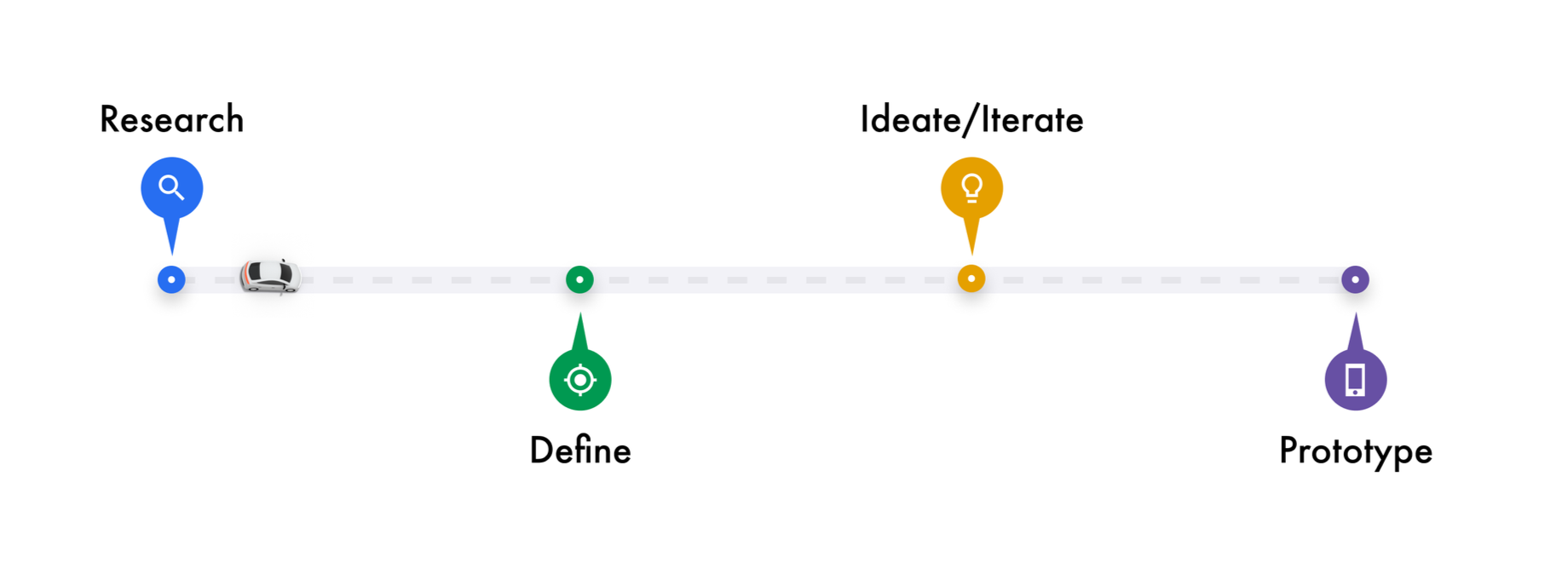
RESEARCH
Through in-depth qualitative research, we identified the expectations and goals of both riders and drivers, as well as their respective needs, pain points, and communication gaps during the trip. To validate our findings, we triangulated data using four qualitative research methods. Click here to view the full research report.
DEFINE
We analyzed our research findings and identified a key insight: communication challenges before and after the in-car experience lead to frustration and lower satisfaction for both riders and drivers. These pain points occur across multiple touch points—at pickup and drop-off, in pre- and post-trip communications, and during the rating process.
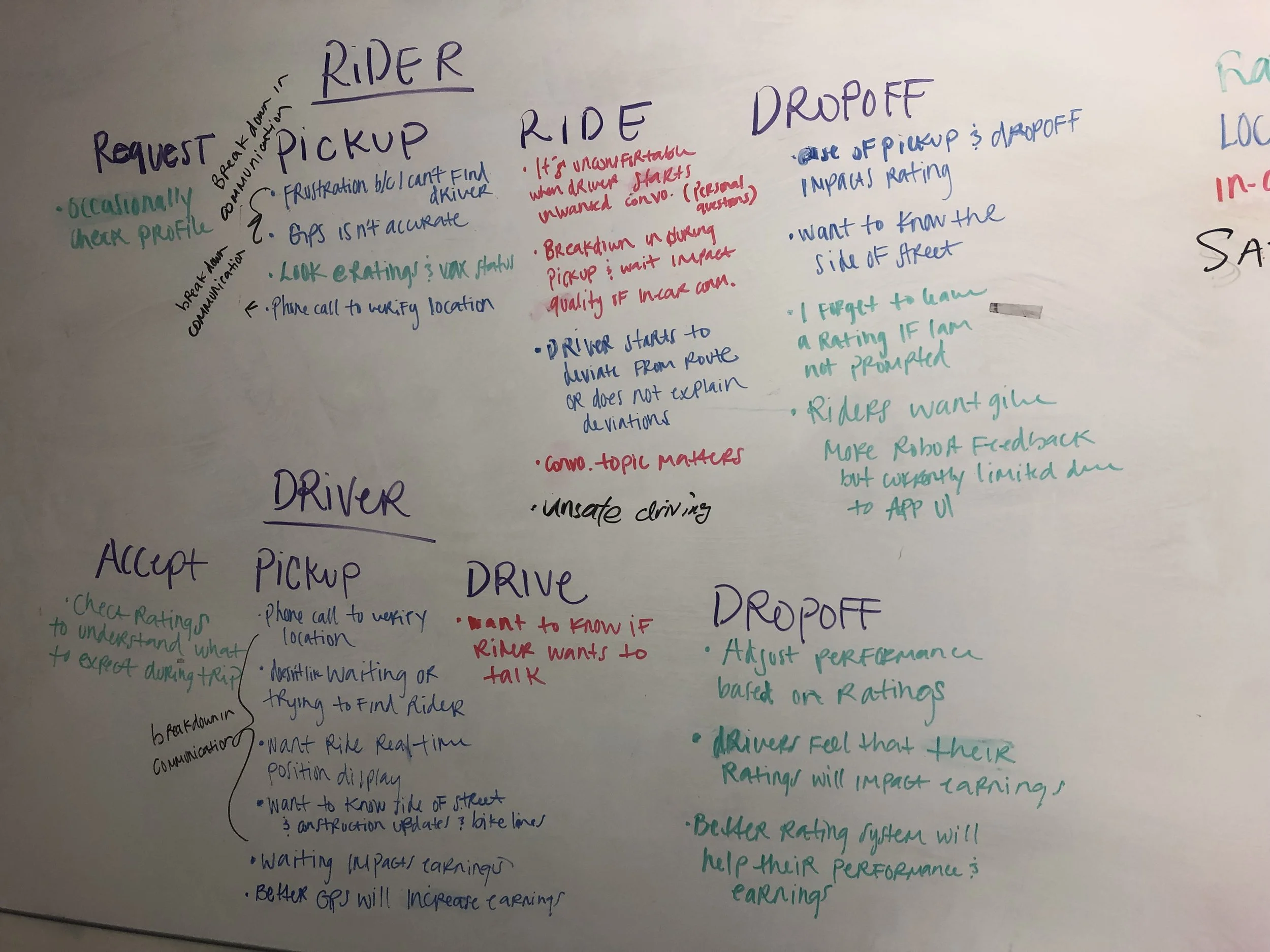
Rider and driver trip journey identifying pain points and needs
Location (Pickup & Drop-off)
Drivers have low trust in the pickup location displayed in the app and sometimes text or call riders to confirm.
Riders, too, have low trust in the GPS features and feel that their designated pickup location might not be clear to driver.
Communication (Pre and post-trip)
Drivers would like to see riders’ real-time location and provide rider with timely updates of any construction or other blockage en route.
Riders want to be aware of any delays and want to be able to easily find their driver when they arrive.
Trip ratings
Drivers rely on ratings and reviews to understand their performance and ratings could affect their mood.
Riders need to see a more robust and authentic rating system to provide more genuine and constructive feedback.
We created a journey map to understand how pain points impact the entire trip experience and to identify overlapping communication barriers between riders and drivers.
After identifying the needs and pain points of riders and drivers, we defined key customer problem statements to guide our design process.
“As a frequent rider, I want to be notified of delays and for my pickup location to be clear to the driver so that I can get to my destination easily and quickly.”
“As a frequent rider, the rating system does not feel authentic. I need a more robust rating system so that I can provide better feedback to the driver.”
“As a full-time driver, when I pick up a rider I need their pick-up location to be clearly communicated and easily accessible so that I can complete the ride efficiently. Waiting on passengers or rerouting wastes time and money.”
“As a driver who cares about in-car requests, I rely on riders’ ratings and reviews to improve my performance and provide my future riders with good experience.”
Uber’s original design question assumed that encouraging empathetic interaction would elevate the overall trip experience. However, research revealed this wasn’t a primary concern for riders and drivers. We reframed our design question to focus on goals and pain points identified through research.
IDEATE
We began our design process by creating ‘How Might We’ statements for each customer problem. Using the Crazy 8 exercise, we generated a range of ideas and prioritized solutions by ranking each across three categories: “New” (innovative and cutting-edge), “Useful” (solves the customer problem), and “Feasible” (easily implemented by Uber’s engineering team). Click here to view the full design process report.
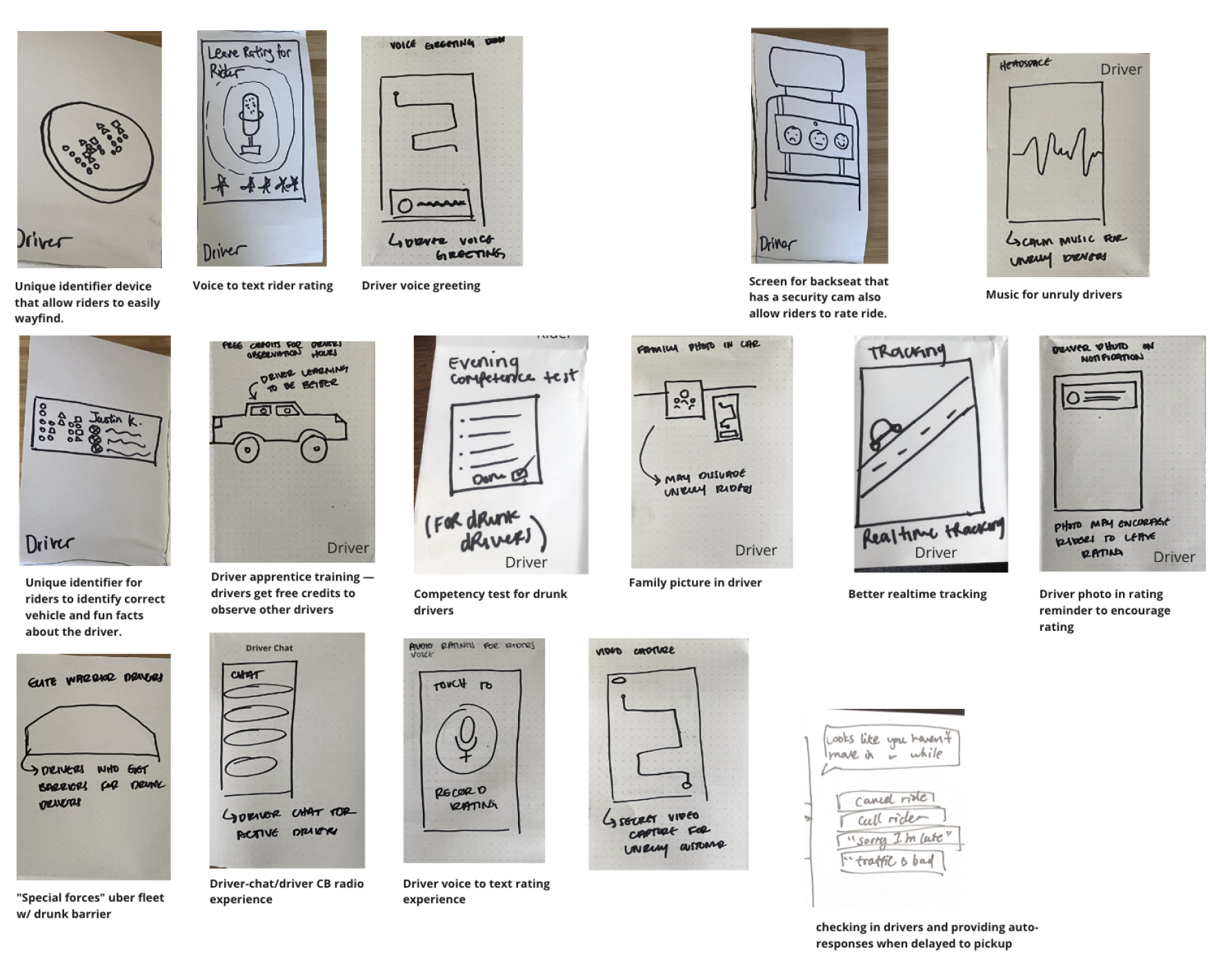
Crazy 8 sketches
Crazy 8 sketches
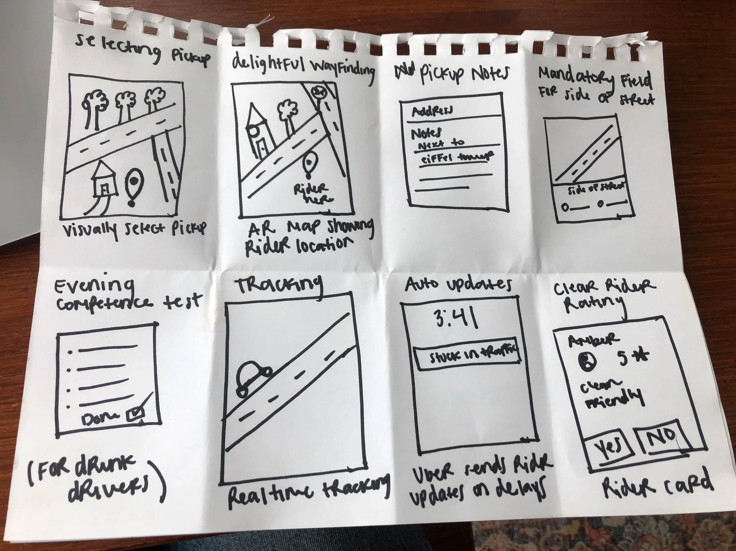
We created storyboards to conceptualize our design ideas, then tested the early concepts with riders and drivers to gather feedback. Of the 15 concepts tested, four emerged as strong candidates for further iteration:
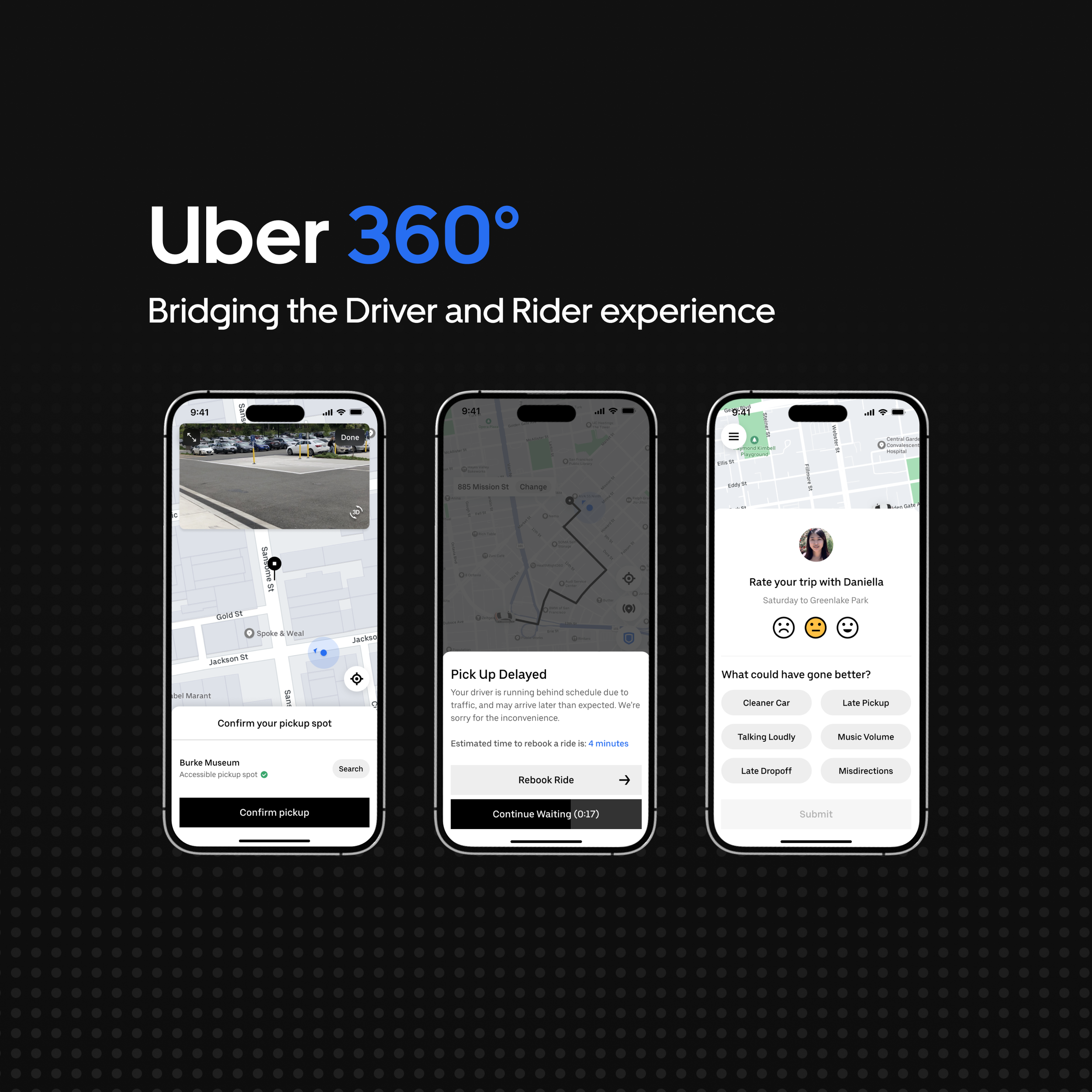
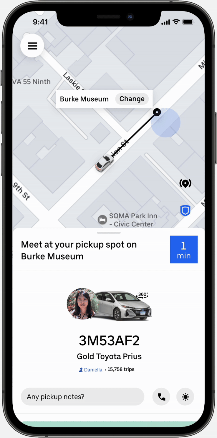
Concept one: Visual pick-up selection
This concept addresses the problem of unclear pickup locations, which cause delays for both riders and drivers. This solution allows rider to visually verify their pickup location by sending a street-view photo to their driver.
Concept two: En-route delay notification
This concept addresses communication transparency when drivers encounter issues en route that delay pickup. The solution allows drivers to select a reason for the delay, enabling riders to understand why their pickup is taking longer than expected.
Concept three: Enhanced vehicle visibility
This concept addresses pickup delays by giving riders more information about the driver's vehicle. Drivers can upload a 360-degree view of their car, which riders can interact with while waiting for pickup. This allows riders to see the vehicle from multiple angles and identify it more easily upon arrival.
Concept four: Improved rating system
This concept addresses the ambiguity of star ratings by allowing riders to give more nuanced, specific feedback to drivers. This enables more authentic and honest communication.
ITERATE
After finalizing our design concepts, we built mid-fidelity prototypes and tested them with three riders and three drivers. Our usability study evaluated how effectively our solutions: 1) solved the problems identified in research, and 2) helped users reach their trip goals.
Findings:
Riders found the 3D street view to be confusing. Specifically the change of going from 2D to 3D.
Seeing both inaccessible and accessible pins was distracting (yellow and green pin).
They did not find the toggle useful.
Findings:
Riders found the CTA’s “slide to rebook” and “continue waiting” competing and confusing.
They want to know how much time it will take to rebook another trip.
They did not like the “slide to rebook” button.
Findings:
Riders enjoyed this feature and liked that the photo is enlarged to a 360 view. They requested for this feature to appear automatically when driver arrives.
Findings:
Riders missed the ability to select a star rating. They desired some kind of scale that maps to their level of satisfaction.
Riders did like a way to elaborate on why something went wrong.
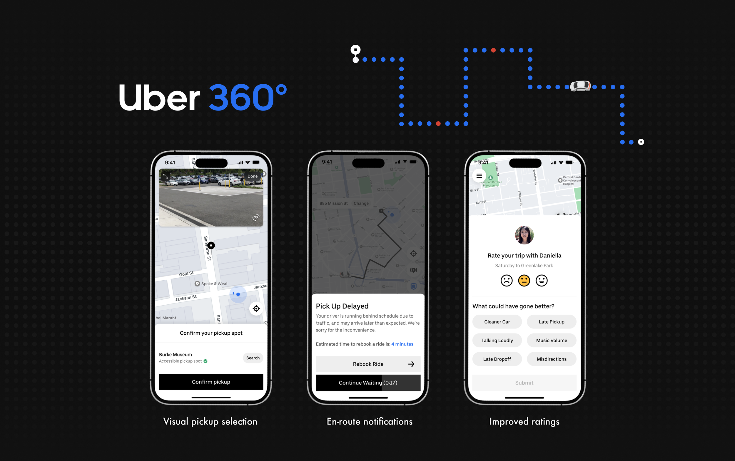
FINAL PROTOTYPE
Based on the findings from usability testing, we iterated on our design solutions to incorporate the usability findings in the final design for each of the four key features. Click here to view the hi-fidelity designs for both riders and drivers.
Visual pick-up selection
En-route delay notification
Enhanced vehicle visibility
Improved rating system
FINAL THOUGHTS
This project was a joy to work on from the start ✨. The best part was partnering with such a talented group of designers. It challenged us to expand our understanding of communication. We learned that communication doesn’t always start with direct verbal dialogue—it begins with subtle verbal or non-verbal micro-interactions before the meet-up that can either improve or hinder the connection between two people. For Uber riders and drivers, these interactions began long before the in-car meet-up. Improving these micro-interactions ultimately led to greater satisfaction and a better trip experience.